<Back to Index>
- Graphic Designer and Film Director Saul Bass, 1920
- Graphic Designers Ivan Chermayeff & Tom Geismar, 1957
- Graphic Designer Michael Patrick Cronan, 1951
PAGE SPONSOR
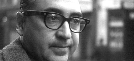
Saul Bass (May 8, 1920 – April 25, 1996) was a graphic designer and filmmaker, best known for his design of film posters and motion picture title sequences.
During his 40 year career Bass worked for some of Hollywood's greatest filmmakers, including Alfred Hitchcock, Otto Preminger, Billy Wilder, Stanley Kubrick and Martin Scorsese. Amongst his most famous title sequences are the animated paper cut-out of a heroin addict's arm for Preminger's The Man with the Golden Arm, the credits racing up and down what eventually becomes a high angle shot of the United Nations building in Hitchcock's North by Northwest, and the disjointed text that races together and apart in Psycho.
Bass designed some of the most iconic corporate logos in North America, including the AT&T "bell" logo in 1969, as well as AT&T's "globe" logo in 1983 after the breakup of the Bell System. He also designed Continental Airlines' 1968 "jetstream" logo and United Airlines' 1974 "tulip" logo which became some of the most recognized airline industry logos of the era.
Saul Bass was born on May 8, 1920, in the Bronx, New York, to Eastern
European Jewish immigrant parents. He graduated from James Monroe High
School in the Bronx and studied part time at the Art Students League in
Manhattan until attending night classes with György Kepes at Brooklyn College.
He began his time in Hollywood during the 1940s doing print work for
film ads, until he collaborated with filmmaker Otto Preminger to design
the film poster for his 1954 film Carmen Jones.
Preminger was so impressed with Bass's work that he asked him to
produce the title sequence as well. This was when Bass first saw the
opportunity to create something more than a title sequence, but to
create something which would ultimately enhance the experience of the
audience and contribute to the mood and the theme of the movie within
the opening moments. Bass was one of the first to realize the creative
potential of the opening and closing credits of a movie.
Bass became widely known in the film industry after creating the title sequence for Otto Preminger's The Man with the Golden Arm (1955). The subject of the film was a jazz musician's struggle to overcome his heroin addiction, a taboo subject in the mid '50s. Bass decided to create a controversial title sequence to match the film's controversial subject. He chose the arm as the central image, as the arm is a strong image relating to drug addiction. The titles featured an animated, white on black paper cut - out arm of a heroin addict. As he expected, it caused quite a sensation.
For Alfred Hitchcock, Bass provided effective, memorable title sequences, inventing a new type of kinetic typography, for North by Northwest (1959), Vertigo (1958), working with John Whitney, and Psycho (1960). It was this kind of innovative, revolutionary work that made Bass a revered graphic designer. Before the advent of Bass’s title sequences in the 1950s, titles were generally static, separate from the movie, and it was common for them to be projected onto the cinema curtains, the curtains only being raised right before the first scene of the movie.
Bass once described his main goal for his title sequences as being to ‘’try to reach for a simple, visual phrase that tells you what the picture is all about and evokes the essence of the story”. Another philosophy that Bass described as influencing his title sequences was the goal of getting the audience to see familiar parts of their world in an unfamiliar way. Examples of this or what he described as “making the ordinary extraordinary” can be seen in Walk on the Wild Side (1962) where an ordinary cat becomes a mysterious prowling predator, and in Nine Hours to Rama (1963) where the interior workings of a clock become an expansive new landscape.
He designed title sequences for more than 40 years, and employed diverse film making techniques, from cut-out animation for Anatomy of a Murder (1958), to fully animated mini - movies such as the epilogue for Around the World in 80 Days (1956), and live action sequences. His live action opening title sequences often served as prologues to their films and transitioned seamlessly into their opening scenes. These “time before” title sequences either compress or expand time with startling results. The title sequence to Grand Prix (1966) portrays the moments before the opening race in Monte Carlo, the title sequence to The Big Country (1958) depicts the days it takes a stage coach to travel to a remote Western town, and the opening montage title sequence to The Victors (1963) chronicles the twenty seven years between WWI and the middle of WWII, where the film begins.
Toward the end of his career, he was rediscovered by James L. Brooks and Martin Scorsese who had grown up admiring his film work. For Scorsese, Saul Bass (in collaboration with his wife Elaine Bass) created title sequences for Goodfellas (1990), Cape Fear (1991), The Age of Innocence (1993), and Casino (1995), his last title sequence. His later work with Martin Scorsese saw him move away from the optical techniques that he had pioneered and move into the use of computerized effects. Bass’s title sequences featured new and innovative methods of production and startling graphic design.
In some sense, all modern opening title sequences that introduce the
mood or theme of a film can be seen as a legacy of Saul Bass's
innovative work. In particular, though, title sequences for some recent
movies and television series, especially those whose setting is during
the 1960s, have purposely emulated the graphic style of his animated
sequences from that era. Some examples of title sequences that pay
homage to Bass’s graphics and animated title sequences are Catch Me If You Can (2002), X-Men: First Class (2011), and the opening to the AMC series Mad Men.
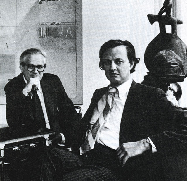
Chermayeff & Geismar is a New York based branding and graphic design firm. It was founded in 1957 by Yale graduates Ivan Chermayeff and Tom Geismar. The firm is famous for designing logos for such companies as Pan Am, Mobil Oil, PBS, Chase Bank, Barneys New York, The Museum of Modern Art, Xerox, Smithsonian Institution, NBC, Cornell University, National Geographic, and many others. Ivan Chermayeff and Thomas Geismar were awarded the AIGA Medal in 1979.
In 2007, designer Sagi Haviv became the third partner at the firm. In 2008, Haviv, Chermayeff and Geismar released a new identity for the Library of Congress, and in 2009 redesigned the logo of the fashion brand Armani Exchange. In recent years, the firm created identities for the Kennedy Center Honors; Hearst Corporation, the Southern Poverty Law Center, The John D. and Catherine T. MacArthur Foundation, Conservation International, the Women's Tennis Association and other major institutions.
Chermayeff & Geismar is also known for the exhibits and
environmental art installations it has designed, including the Ellis
Island Immigration Museum, the Statue of Liberty
Museum, two Worlds Fair pavilions (the U.S. pavilions of 1967 and
1970), and the red number 9 at 9 West 57th Street in New York City. In
2008, the new Star - Spangled Banner exhibit designed by the firm opened
at the Smithsonian National Museum of American History
in Washington, D.C. The firm also designs motion graphics such as the
titles for the Emmy Award winning PBS documentary series Carrier and in
2009, created a motion graphics display for Alicia Keys’ annual
fundraiser for her Keep a Child Alive Foundation.

Michael Patrick Cronan (b. June 9, 1951 - January 1, 2013) was an American graphic designer, artist and an American Institute of Graphic Arts Fellow based in Berkeley California. One of the founders of the San Francisco Bay Area postmodern movement in graphic design that became known as the "Pacific Wave", and a recognized corporate identity designer, acknowledged for the naming and the identities of TiVo, Verio, the Indigo, Onyx and Crimson computer lines for Silicon Graphics (SGI) and naming Amazon Kindle.
Michael Cronan was born in San Francisco in 1951 and grew up in the suburbs of Sacramento along the Sacramento and American rivers. As a teenager he learned letterpress printing and became an artist in a local print shop where he created posters. He studied at the California College of Arts and Crafts (CCAC) (now California College of the Arts), where he later served as adjunct professor of graphic design from 1981 to 2001. In 1971 Cronan went abroad to study archeology and work as an archeological dig manager for Hebrew University in the Negev Desert and the at Dead Sea. In 1974 he received a Bachelor Degree in Fine Art from California State University, Sacramento.
Cronan and partner Karin Hibma established the design firm Michael Patrick Cronan Design in 1980 with clients including Levi Strauss & Company, Apple Computer, Estée Lauder Origins and Williams - Sonoma as well as the San Francisco Symphony, the Oakland Museum, The Pickle Family Circus, and SFMOMA. He was a founding member of the American Institute of Graphic Art (AIGA) chapter in San Francisco and the AIGASF chapter president after serving on the AIGA national board for three years.
In 1981 Cronan designed SUSHI, a book that launched a new form of food book.
In 1985 Cronan was included with thirty - five American Designers in "Pacific Wave" an exhibition of graphic design curated by Giorgio Camuffo at Museo Fortuny, Venice, Italy.
In 1989 Cronan and Hibma expanded their design palette to include clothing with the creation of the Walking Man, a line of apparel which became the focus of a number of articles and books about designers creating their own products as well as attracting a loyal customer following. In 1992 and 1993 Walking Man clothing won the I.D. Magazine Consumer Product of the Year / Gold Award presented at the Cooper Hewitt National Design Museum, New York.
Also in 1993 Cronan was featured in "In the Public Eye - the work of Four Graphic Designers" including Michael Manwaring, Gerald Reis and Michael Vanderbyl. It was the first graphic design exhibition at the San Francisco Museum of Modern Art (SFMOMA), and its popularity ushered in an expanded presence of graphics in the museum's floor space and permanent collection. In the commentary for the exhibition New York designer Michael Bierut described Cronan's logos as, "the effortless transmutation of dumb drawings into potent icons." SFMOMA's Curator of Architecture and Design, Paolo Polledri wrote, "For Cronan, design is an experience the designer shares with an audience. The designer investigates and clarifies needs expressed by others. This process requires a high degree of empathy, since the designer must sense the dreams, memories, and expectations of others and translate them into images that can be commonly understood. As a result, the audience gains something from the process. For Cronan, design is more than art, it is a service," and "Humor performs an important function in Cronan's polymorphic designs. Never completely absent, it is never abrasive. It adds a human touch, rather than subtracting from the seriousness of the subject."
In 1998 SFMOMA commissioned Cronan to create the SFMOMA symbol which graphically captures the distinctive oculus at the center of the museum building designed by Mario Botta.
Later that year Cronan created the stamp commemorating the fiftieth anniversary of NATO for the United States Postal Service and later the Prostate Awareness stamp.
In 2002 Cronan's work was included US Design: 1975 - 2000 a survey of 250 objects and images first shown at the Denver Art Museum, organized by the Museum's curator R. Craig Miller. ArchNews described the exhibition as "some of the most exciting work produced by American based designers during the past 25 years."
His graphic design work is currently in the permanent collections of SFMOMA, the Denver Art Museum, the Library of Congress in Washington, DC, The Smithsonian National Postal Museum, and London's Victoria and Albert Museum.
Cronan was Chairman of the Board of the Pickle Family Circus, attended the Aspen Leadership Summit in 2005 and served on the Board of the Aspen Design Summit 2005 - 2006. He has created identities for and served on the advisory boards of non - profits such as the Family Violence Prevention Fund - Founding Fathers, among others.
Cronan has been subject of profile articles in Communication Arts Magazine, I.D. Magazine, Linea Graphica (Italy), Graphis Inc., HOW, among many others and books including Designing Brand Identity: A Complete Guide to Creating, Building, and Maintaining Strong Brands, A History of Graphic Design, Meggs, Making Graphic Design History and The Design Entrepreneur, Graphis Brand. His award winning work has been published extensively in graphic design annuals and other publications. He spoke to design communities and judged design competitions throughout the United States and internationally.
Since
2005 Cronan focused on creating names, visual identities
and brand strategies for new products, companies and emerging
technologies. In June 2009, he and Karin Hibma were named two of Fast
Company's list of 100 Most Creative People in Business.
On January 1, 2013, Cronan died at his Berkeley home after a long
battle with cancer. He had been diagnosed five years previously. He was
61.