<Back to Index>
- Graphic Designer Carolyn Davidson, 1900+
- Cartoonist and Graphic Artist Theodore "Ted" W. Drake, 1907
- Graphic Designer Allan Robb Fleming, 1929
PAGE SPONSOR

Carolyn Davidson is a graphic designer best known as the creator of the Nike "swoosh".
Davidson designed the swoosh in 1971 while a graphic design student at Portland State University. Phil Knight, who was teaching an accounting class at the university, noticed Davidson working on an assignment, and asked her to do some work for what was then Blue Ribbon Sports, Inc. Needing to choose a logo in order to meet looming production deadlines, Knight settled on the swoosh, after rejecting various other designs. At the time, he stated of the logo, "I don't love it, but it will grow on me."
For her services, she billed the company $35. The swoosh became an instantly recognizable insignia for Nike around the world, and Davidson continued working for what is now Nike, Inc. Eventually, the design demands of the company grew beyond one person's capacity, and she turned over her duties to Nike's new advertising agency.
Although Davidson left Nike in September 1983, Knight invited her to a company lunch. There, he presented her with a diamond ring engraved with the swoosh, and an undisclosed amount of Nike stock. Of the gift, Davidson says, "this was something rather special for Phil to do, because I originally billed him and he paid that invoice."
Davidson retired in 2000, and now engages in hobbies and volunteer work, including weekly duties at the Ronald McDonald House at Legacy Emanuel Hospital & Health Center.

Theodore "Ted" W. Drake (September 2, 1907 – May 25, 2000) was an American cartoonist, graphic artist, and sports artist known for creating the college sports mascot the Notre Dame Leprechaun.
Drake is probably best remembered for the creation of the Notre Dame Leprechaun, for which he was paid $50. The Leprechaun was first used on the 1964 football pocket schedule and later on the football program covers. An immediate success, the Leprechaun was featured on the cover of Time magazine in November 1964.
Drake also designed the Chicago Bulls logo.
In the early 1950s, Drake was the main graphic artist for the Kukla, Fran and Ollie
television puppet show, creating its opening titles along with album
covers, newsletters, advertisements, and even Christmas cards.


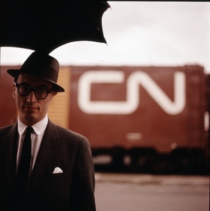
Allan Robb Fleming (7 May 1929 – 31 December 1977) was a Canadian graphic designer best known for having created the Canadian National Railway logo, designing the best selling 1967 Centennial book Canada: A Year of the Land / Canada, du temps qui passe, and for revolutionizing the look of scholarly publishing in Canada, particularly at University of Toronto Press.
Born in Toronto, Ontario, he was Vice President and Director of Creative Services at the typographic firm Cooper and Beatty Ltd. when he designed the new CN logo in 1959. In 1962, he became art director for Maclean's magazine. From 1963 to 1968, he was director of creative services at MacLaren Advertising. From 1968 to 1976, he was the chief designer at the University of Toronto Press.
He was a member of the Royal Canadian Academy of Arts and the Alliance Graphique Internationale, a Fellow of the Ontario College of Art, and the first Fellow of the Society of Graphic Designers of Canada.
Allan Robb Fleming was the son of Isabella Osborne Fleming, a nurse, and Allan Stevenson Fleming, a clerk with Canadian National Railways. They were both Scottish immigrants to Toronto.
Between 1937 and 1939 the young Allan was hospitalized in Sick Children’s Hospital in Toronto because of an ear infection that required radical surgery and caused the permanent loss of hearing in his left ear. He never forgot the trauma. In 1939 Allan and his mother traveled to California as part of his recuperation; attending the Hollywood Premier of "The Wizard of Oz" formed an indelible impression.
Back in Toronto, he attended Western Technical Collegiate from 1943 to 1945 in the commercial art stream. When he was 15, in 1944, his father died of bone cancer. From 1945 until 1947 Fleming worked as an illustrator in the mail order advertising department of the T. Eaton Company, and then until 1951 became a layout artist with Art Associates Studio and an art director with the advertising firm Aikin McCracken.
Fleming married Nancy Barbara Chisholm in 1951. Working at the
advertising firm Art and Design Service, he was involved with clients
such as Ford, Helena Rubenstein, and Kaiser - Frazer. In April 1953, the
Flemings relocated to England for two years, where Fleming studied
letterforms and the design of type and books, being mentored by such
eminent English designers and design historians as Stanley Morison,
Oliver Simon, Herbert Spencer and Beatrice Warde.
When the Flemings returned to Toronto in May 1955, Allan set up as a freelance designer with illustrator Lewis Parker and taught part time at the Ontario College of Art. He became head of typography at the college, a post he held until 1961. He also set up an independent graphic design studio in his home in November 1955, hiring his then student, Ken Rodmell, as his assistant a year later. It was in this period that Fleming designed his first book.
In September 1957 Fleming joined Cooper & Beatty Typesetters as typographic director and designer. The range and flair of the work he effected for C&B garnered attention internationally, and brought in a host of awards from the New York Art Directors Club, the Type Directors Club of New York, and the AIGA among others. As well as paying work for companies such as General Motors, London Life, the Hudson’s Bay Company, and others, Fleming produced witty and effective advertising ephemera for C&B itself. He also designed the “Type-o-file,” an innovative pick - and - mix box of type specimens arranged by family.
Fleming also co-organized (with Franklyn Smith) a number of
significant exhibitions of internationally acclaimed designers such as
Karl Gerstner, Hermann Zapf and Saul Bass at C&B's headquarters in
Toronto. In 1958 he attended the highly influential Silvermine
Conference ("The Art and Science of Typography: An International Seminar
of Typographic Design") in Norwalk, Connecticut, delivering that year
the Rous Lecture on Typography at the Ontario College of Art, on the
subject of legibility. The Flemings’ first daughter, Martha, was born in
October 1958.
In 1959 the New York industrial design firm James Valkus commissioned Fleming to create a new logo for Canadian National Railways as a key part of Valkus' company wide corporate redesign program. The resulting logo, launched in 1960, is still in use today and acclaimed as one of the top 50 corporate logos of all time by design historian Alice Rawsthorn [Report on Business, October 2000]. In this same year he designed an innovative and gritty fundraising brochure in an unusual photo - documentary style for the United Church of Canada, as well as “Printing and Social Change” by Marshall McLuhan, which was published in Printing Progress: A Mid - Century Report by the International Association of Printing House Craftsmen. Fleming also established his first private press that year, the Tortoise Press, whose first book was Eight Poems, by Richard Outram.
Besides launching the CN symbol in 1960, Fleming redesigned the Bank of Nova Scotia logo, and worked on projects for Dow Chemical Company, Salada Foods, Jordan Wines, Vickers and Benson, Eaton’s, and of course Cooper & Beatty. He began designing more books, such as the Montreal Museum of Fine Arts’ Paul - Emile Borduas and the National Gallery of Canada’s Canadian Painters in Watercolour and Folk Painters of the Canadian West. Peter Fleming, Nancy and Allan’s only son, was born in August.
From late June to early September 1960 Fleming traveled to the UK
and Europe on a Canada Council for the Arts grant, meeting among others
Jan Tschichold, Karl Gerstner, and Gunter Gerhard Lange of the Berthold
type - foundry. He exhibited work at Monotype House Gallery in London at
the invitation of Beatrice Warde, gave an address on North American
graphic design, and persuaded Ken Rodmell, then living in London, to
return to Toronto to work for him at Cooper & Beatty and join Jim
Donoahue who by then also worked in the creative department at C&B.
In 1961, Fleming became vice president and typographic director in
charge of creative services at C&B.
1962 was another busy year for Fleming. He designed a logo for the Montreal Trust Company; letterhead for Hawker Siddeley Canada; graphics and the logo for Toronto’s Malton Airport (architect John B. Parkin); all signage, monumental lettering, and the foundation stone for Massey College at the University of Toronto (architect Ron Thom); annual reports and invitations; and much more. But in November 1962, he left C&B in order to become art director at Maclean’s magazine. After a tumultuous nine months there, during which Fleming radically redesigned the look of the magazine, he was hired as executive art director at MacLaren Advertising Company Ltd. Its clients included General Electric, General Motors, Hockey Night in Canada, Imperial Oil, and Lever Brothers. That same year Fleming was commissioned to design a new logo for Ontario Hydro (launched 1965), as well as the crest, letterhead, and other related materials for the new Trent University in Peterborough, Ontario (architect Ron Thom). In April 1963, Allan and Nancy’s third child, Susannah, was born.
Fleming was promoted in 1965 to vice president and associate general manager, creative department at MacLaren Advertising. Fleming was involved that year in Liberal Party campaign materials – an election the Liberals won. In 1966 Fleming became a MacLaren’s director; by then he was responsible for the work of sixty - three staff in creative services. Among other accomplishments that year, seven of Fleming’s projects were chosen for exhibition in Typomundus 20, the first international juried exhibition of typographic design, which was held in Toronto.
Lorraine Monk of the National Film Board, Still Photography Division,
commissioned Fleming to design the sumptuous NFB Centennial book, Canada: A Year of the Land / Canada, du temps qui passe, for which he was awarded the Centennial Medal of Canada and a gold medal for book design at Graphica ’67'.
In 1968 the first hint of heart trouble occurred. Fleming was unwell that spring, and left MacLaren Advertising in May, though he continued to be on the board of directors and served as a creative consultant. That month he shifted gears to become chief of design at the University of Toronto Press, a post that was created for him, and an association he maintained until his death in 1977. UTP was then the fourth largest university press in North America, publishing an average of eighty to a hundred books a year.
While revolutionizing the look of scholarly books at UTP, Fleming
also continued to do a wide variety of other design jobs for the Canada
Council, Galanty Productions, Gramercy Holding Ltd, Jordan Wines, Philip
and Noah Torno, the Hudson’s Bay Company, and other MacLaren
Advertising clients. With master printer Ernie Herzig, he set up another
small press, Martlet Press, which produced among others high quality
photography books with the National Film Board. A UTP Christmas
keepsake, The Alphabet Book, by Kettle Point School and Anne and Alex Wyse, won an AIGA '50 Books of the Year'. The Martlet Press’s own John Fillion: Thoughts About My Sculpture also won an AIGA award.
In 1969 Fleming designed both a symbol and the launch publications for the new Ontario Science Centre, a symbol for the Metropolitan Toronto Separate School Board, the NE Thing Company logo, and a style guide for Canada Post that set the bar for the next 20 years. As a public educationalist, he was also a driving force behind such exhibitions as Art at the Service of Intention: Graphic Designers at Work (Art Gallery of Ontario), and appeared on Robert Fulford’s TV program, 'On Books'. Two of UTP’s publications designed by Fleming -- The Economic Atlas of Ontario and Rural Ontario -- won AIGA awards in 1969. The following year, Fleming designed a logo for the Metropolitan Educational Television Authority and one for Gray Coach Lines, and was appointed to the National Design Council. Fleming also found time for civic duty, designing posters for the "Stop the Spadina Expressway" movement spearheaded by Jane Jacobs, Marshall McLuhan and William Kilbourn. Also in 1971, another UTP book, Goethe’s Faust, translated by the renowned literary scholar and painter Barker Fairley and illustrated by one of Fleming’s protégés, Randy Jones, won yet another AIGA award, and The Economic Atlas of Ontario won the World’s Most Beautiful Book prize at the Leipzig International Exhibition of Book Arts. 1971 saw Fleming designing the United Church of Canada’s new Hymnal, in tandem with designer and UTP colleague Laurie Lewis. A notable UTP book that year was Sculpture Inuit, done for the Canadian Eskimo Arts Council. Closer to home, Fleming's Martlet Press published Twenty - Eight Drawings by Barbara Howard: Howard was a close family friend, the wife of poet Richard Outram. And, in exchange for books for his considerable collection, Fleming also began designing stationery and catalogs for Monk Bretton Books, an antiquarian book dealer specializing in fine press books.
In June 1971 Fleming had a heart attack while in Halifax and then a few months later a paralyzing stroke, forcing him to go on disability leave from UTP. He didn’t stop working, designing philatelic materials for Canada Post such as a stamp with the artist Alma Duncan, first day covers for the Paul Kane and British Columbia centennial stamps, and writing and hosting a program for CBC TV entitled “Calligraphy: My Love Affair with the Alphabet.” Quill & Quire, the monthly Canadian book trade magazine, ran a feature on AF, and he continued to make regular contributions to professional gatherings. By 1972 Fleming had returned to UTP, but not for long: he suffered another debilitating heart attack early in the year.
In 1973, Fleming joined Burton Kramer Associates as one of two principals, alongside Kramer. Among other projects during that period, the firm developed the new visual identity for the CBC and for Reed Paper. Concurrently, he also incorporated as Allan R. Fleming Graphic Design Consultants, but in August he experienced further heart problems which forced him to cut back on various activities. A highlight of the year was being made a fellow of the Ontario College of Art, the first year this honor had been given, alongside the painter A.Y. Jackson. Another NFB book, "Canada", won the Leipzig World’s Most Beautiful Book prize.
As of January 1974 Fleming became a director of the industrial design firm Kuypers Adamson Norton Ltd. and launched the CBC symbol with Burton Kramer. St Thomas’s Anglican Church in Toronto commissioned him to design a logo for its centennial, and continued to design philatelic materials for Canada Post. His work with UTP that year included the template for The Collected Works of Erasmus, which is still used by UTP for this monumental editorial project, and another AIGA award winner, Clarence Tracy’s The Rape Observ’d.
He resigned from Burton Kramer Associates Ltd in March 1976, joining Burns Cooper Donaohue and Fleming the following month. The range of his work from that office covered his complete editorial redesign for Canada's newspaper The Financial Post, a logo for media company Torstar, packaging design for MacKenzie Seeds and an award winning album cover for singer - songwriter Sylvia Tyson.
It was a tumultuous year: in March he also left his wife and family and set up house with an editor from UTP, Prudence Tracy. A solo exhibition of Fleming's work curated by Alvin Balkind opened at the Vancouver Art Gallery; the exhibition also traveled to the Alberta College of Art in Calgary, and coming back to Toronto from the opening there, Fleming suffered a stroke. In late December Fleming had a cardiopulmonary collapse, from which he died on 31 December.
This outlined trajectory of Allan Fleming’s career gives a sense of his personality and energy if only by demonstrating the sheer quantity and variety of his undertakings, but a simple chronology can’t adequately suggest what Brian Donnelly in issue 63 of The Devil’s Artisan calls “his persuasive presentation style and genuine brilliance with words.” Nor can it convey the attentive and inclusive style that made Fleming such an inspiring colleague and friend: one from whom all who were interested could learn. He was an indefatigable mentor, teacher and public champion of design in all aspects of Canadian cultural life. He revolutionized more than the design department at UTP; he also revolutionized the relationship between editors, designers, and production and marketing employees, inspiring all with his camaraderie and brilliant innovation. This ability to inspire and galvanize disparate professionals was also a hallmark of his work in advertising and in typographic design, when those professions were not the flat hierarchies they have since become. His early death was a great loss to family and friends, but his work as a designer, collaborator and teacher continues to reverberate through the Canadian design world and beyond.