<Back to Index>
- Graphic Designer John David Lloyd, 1944
- Industrial Designer Raymond Loewy, 1893
- Graphic Designer Herbert F. "Herb" Lubalin, 1918
PAGE SPONSOR
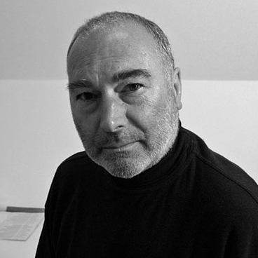
John David Lloyd (born 1944) is a British graphic designer who in 1975 co-founded the international design consultancy, Lloyd Northover. He has worked in all fields of graphic design but has specialized in corporate identity.
Lloyd started his design career in 1960, as an apprentice lithographic artist in the printing industry. He began full time study in 1964, first at South West Essex School of Art, and in 1965 at the London College of Printing. On graduating in 1968, he joined Allied International Designers in London, leaving in 1975 to co-found Lloyd Northover with fellow designer, Jim Northover. He has been a teacher and examiner at the London College of Printing (now the London College of Communication), an examiner at Nottingham Trent University, and a D&AD jury member. He was Chairman of the British Design Export Group from 1983 - 85. With Jim Northover, he has won many awards, including the Grand Prix in the International Design Effectiveness Awards, and the International Gold Award at the New York Art Directors Club. He has worked internationally and has spoken at conferences in Europe, North America and Asia. Lloyd is currently an independent consultant, artist, and writer.
Origins: The Lloyd/Northover creative partnership has been enduring. Lloyd met Jim Northover in 1965 at the London College of Printing. They soon began to work together and their earliest collaborative work – posters for the LCP Film Society, Whitechapel Gallery and University of London Arts Festival – were designed at the LCP in the 1960s.
Early years 1975 - 1980: The Lloyd Northover design consultancy (Lloyd Northover Limited) was formally launched in 1975. Early clients included the English Tourist Board, Royal Shakespeare Company, Arts Council, American Express, and IBM. In 1981 the Design Council invited Lloyd Northover to mount an exhibition of their work at the Design Centre in London and the Scottish Design Centre in Glasgow.
Steady growth 1981 - 1990: By the mid 1980s, the emphasis of the consultancy’s work had shifted from print design to the design and implementation of substantial corporate identity programs. Key projects from these years are BAA (British Airports), John Lewis Partnership, and Courtaulds, which broke new ground and was awarded the Grand Prix in the first Design Effectiveness Awards in 1989.
International expansion 1991 - 2000: Asia Pacific: In 1993 Lloyd Northover won a commission to create an identity for Hong Kong’s Airport Express. The consultancy provided naming, and the design of graphics, liveries, interiors, signage, and passenger information. Lloyd Northover’s Hong Kong office went on to serve the wider transport sector in the Asia Pacific region.
Europe and the Middle East: During this period, the London office grew substantially whilst in Continental Europe corporate identity assignments were tackled in Finland, Sweden, Germany, Belgium and Switzerland; an office was also opened in Dubai. Lloyd Northover joined the Citigate Communications Group in 1993, which later became part of Incepta Group plc, an international marketing and services group.
USA: Shortly after the death of the eminent American graphic designer, Saul Bass, in 1996, Lloyd and Northover, who were long term admirers of his work, were offered, and accepted, the opportunity to merge their consultancy with Bass Yager, the surviving practice of Saul Bass in Los Angeles. The studio of Saul Bass on Sunset Boulevard became Lloyd Northover's base on the West Coast of America.
2000 - : Lloyd withdrew from Lloyd Northover in 2004. The firm continues to provide brand strategy, corporate design, and implementation.

Raymond Loewy (November 5, 1893 – July 14, 1986) was an industrial designer, and the first to be featured on the cover of Time magazine, on October 31, 1949. Born in France, he spent most of his professional career in the United States. Among his work were the Shell and former BP logos, the Greyhound bus, the Coca - Cola bottle, the Pennsylvania Railroad GG1 and S-1 locomotives, the Lucky Strike package, Coldspot refrigerators, the Studebaker Avanti and Champion, and the Air Force One livery. His career spanned seven decades.
Loewy was born in Paris in 1893, the son of Maximilian Loewy, a Viennese journalist, and the French Marie Labalme. An early accomplishment was the design of a successful model aircraft, which then won the Gordon Bennett Cup in 1908. By the following year he was selling the plane, named the Ayrel. He served in the French army during World War I, attaining the rank of captain. Loewy was wounded in combat and received the Croix de guerre. He boarded a ship to America in 1919 with only his French officer's uniform and $50 in his pocket.
In Loewy's early years in the U.S., he lived in New York and found work as a window designer for department stores, including Macy's, Wanamaker's and Saks in addition to working as a fashion illustrator for Vogue and Harper's Bazaar. In 1929 he received his first industrial design commission to contemporize the appearance of a duplicating machine by Gestetner. Further commissions followed, including work for Westinghouse, the Hupp Motor Company (the Hupmobile styling), and styling the Coldspot refrigerator for Sears - Roebuck. It was this product that established his reputation as an industrial designer. He opened a London office in the mid 1930s. It is still active.
In 1937, Loewy established a relationship with the Pennsylvania Railroad, and his most notable designs for the firm were their passenger locomotives. He designed a streamlined shroud for K4s Pacific #3768 to haul his newly redesigned 1938 Broadway Limited. He followed by styling the experimental S1 locomotive, as well as the T1 class. Later, at the PRR's request, he restyled Baldwin's diesels with a distinctive "sharknose" reminiscent of the T1. While he did not design the famous GG1 electric locomotives, he improved its appearance by recommending welded construction rather than riveted and added a pinstriped paint scheme to highlight its smooth contours.
In addition to locomotive design, Loewy's studios performed many
kinds of design work for the Pennsylvania Railroad including stations,
passenger car interiors, and advertising materials. By 1949, Loewy
employed 143 designers, architects and draftsmen. His business partners
were A. Baker Barnhart, William Snaith and John Breen.
Loewy had a long and fruitful relationship with American car maker Studebaker. Studebaker first retained Loewy and Associates and Helen Dryden as design consultants in 1936 and in 1939 Loewy began work with the principal designer Virgil M Exner. Their designs first began appearing with the late 1930s Studebakers. Loewy also designed a new logo which replaced the "turning wheel" which had been the trademark since 1912.
During World War II, American government restrictions on in-house design departments at Ford, General Motors, and Chrysler
prevented official work on civilian automobiles. Because Loewy's firm
was independent of the fourth largest automobile producer in America, no
such restrictions applied. This permitted Studebaker to launch the
first all new postwar automobile in 1947, two years ahead of the "Big
Three." His team developed an advanced design featuring flush - front
fenders and clean rearward lines. The Loewy staff also created the Starlight body which featured a rear window system wrapping 180° around the rear seat.
In addition to the iconic bullet - nosed Studebakers of 1950 and 1951, the team created the 1953 Studebaker line, highlighted by the Starliner and Starlight coupes. (Publicly credited to Loewy, they were actually the work of Robert Bourke.) The Starlight has consistently ranked as one of the best designed cars of the 1950s in lists compiled since by Collectible Automobile, Car and Driver, and Motor Trend. The '53 Starliner, recognized today as "one of the most beautiful cars ever made", was radical in appearance, as radical in its way as the 1934 Airflow. However, it was beset by production problems. The 1953 Studebakers were actually designed by Robert Bourke, a member of the Loewy's studio but working permanently for Studebaker.
To brand the new line, Loewy also contemporized Studebaker's logo
again by applying the "Lazy S" element. His final commission of the
1950s for Studebaker was the transformation of the Starlight and
Starliner coupes into the Hawk series for the 1956 model year.
In the spring of 1961, Loewy was called back to Studebaker by the company's new president, Sherwood Egbert, to design the Avanti. Egbert hired him to help energize Studebaker's soon - to - be - released line of 1963 passenger cars to attract younger buyers.
Despite the short 40 day schedule allowed to produce a finished design and scale model, Loewy agreed to take the job. He recruited a team consisting of experienced designers, including former Loewy employees John Ebstein; Bob Andrews; and Tom Kellogg, a young student from the Art Center College of Design in Pasadena. The team was sequestered in a house leased for the purpose in Palm Springs, California. Each team member had a role. Andrews and Kellogg handled sketching, Ebstein oversaw the project, and Loewy was the creative director and offered advice.
The Avanti became an instant classic when it was introduced and has many devotees today; others consider its front end styling peculiar. Versions have been produced in limited quantities over the years by a succession of small independent companies, though never with real commercial success.
Loewy retired at the age of 87 in 1980 and returned to his native
France. He died in his Monte Carlo residence in 1986. He was survived by
his second wife Viola and their daughter Laurence. In 1992 Viola Loewy
and British American Tobacco
established the Raymond Loewy Foundation in Hamburg, Germany. The
foundation was established to promote the discipline of industrial
design internationally and preserve the memory of Raymond Loewy. An
annual award of €50,000 is granted to outstanding designers in
recognition of their lifetime achievements. Recent grantees include Philippe Starck and Dieter Rams.
In 1998, Laurence Loewy established Loewy Design in Atlanta, Georgia, to
manage her father's continued interests in the United States. Laurence
died on October 15, 2008 and is survived by her husband David Hagerman
and their son Jacque Loewy. David Hagerman currently manages Loewy
Design and the Loewy Estate. The Loewy Estate is currently cataloging
the Loewy archives and raising funds to open the Raymond Loewy Museum of
Industrial Design, originally envisioned by Laurence Loewy.

Herbert F. Herb) Lubalin (1918 – May 24, 1981) was an American graphic designer. He collaborated with Ralph Ginzburg on three of Ginzburg's magazines: Eros, Fact, and Avant Garde, and was responsible for the creative visual beauty of these publications. He designed a typeface, ITC Avant Garde, for the last of these; this distinctive font could be described as a post - modern interpretation of art deco, and its influence can be seen in logos created in the 1990s and 2000s.
Herb Lubalin entered Cooper Union at the age of seventeen, and quickly became entranced by the possibilities presented by typography as a communicative implement. Gertrude Snyder notes that during this period Lubalin was particularly struck by the differences in interpretation one could impose by changing from one typeface to another, always “fascinated by the look and sound of words (as he) expanded their message with typographic impact.” After graduating in 1939, Lubalin had a difficult time finding work; he was fired from his job at a display firm after requesting a two dollar raise on his weekly salary, up from a paltry eight (around USD100 in 2006 currency). Lubalin would eventually land at Reiss Advertising, and later worked for Sudler & Hennessey, where he practiced his considerable skills and attracted an array of design, typographic and photographic talent that included George Lois, Art Kane and John Pistilli. He served with Sudler for twenty years before leaving to start his own firm, Herb Lubalin, Inc., in 1964.
Lubalin’s private studio gave him the freedom to take on any number of wide ranging projects, from poster and magazine design to packaging and identity solutions. It was here that the designer became best known, particularly for his work with a succession of magazines published by Ralph Ginzburg: Eros, Fact, and Avant Garde. Eros, (Spring 1962 to issue four 1963) which devoted itself to the beauty of the rising sense of sexuality and experimentation, particularly in the burgeoning counterculture, it was a quality production with no advertising and the large format (13 by 10 inches) made it look like a book rather than a quarterly magazine. It was printed on different papers and the editorial design was some the greatest that Lubalin ever did. It quickly folded after an obscenity case brought by the US Postal Service. Ginzburg and Lubalin followed with Fact, which the former largely founded in response to the treatment Eros received. This magazine’s inherent anti - establishment sentiment lent itself to outsider writers who could not be published in mainstream media; Fact managing editor Warren Boroson noted that “most American magazine, emulating the Reader's Digest, wallow in sugar and everything nice; Fact has had the spice all to itself.” Rather than follow with a shocking design template for the publication, Lubalin chose an elegant minimalist palette consisting of dynamic serifed typography balanced by high quality illustrations. The magazine was printed on a budget, so Lubalin stuck with black and white printing on uncoated paper, as well as limiting himself to one or two typefaces and paying a single artist to handle all illustrations at bulk rate rather than dealing with multiple creators. The end result was one of dynamic minimalism that emphasized the underlying sentiment of the magazine better than “the scruffy homemade look of the underground press (or the) screaming typography of sensationalist tabloids” ever could. Fact itself folded in controversy as Eros before it, after being sued for several years by Barry Goldwater, the Republican presidential candidate about whom Fact wrote an article entitled “The Unconscious of a Conservative: A special Issue on the Mind of Barry Goldwater.” Goldwater was awarded a total of $90,000, effectively putting Fact out of business.
Lubalin and Ginzburg again turned one magazine’s demise into the creation of another, releasing Avant Garde six months later. The creation of the magazine’s logogram proved difficult, largely due to the inherent difficulties presented by the incompatible letterform combinations in the title. Lubalin’s solution, one which sought to meet Ginzburg’s hope for an expression of “the advanced, the innovative, the creative,” consisted of tight - fitting letterform combinations to create a futuristic, instantly recognizable identity. The demand for a complete typesetting of the logo was extreme in the design community, so Lubalin released ITC Avant Garde from his International Typeface Corporation in 1970. Unfortunately, Lubalin quickly realized that Avant Garde was widely misunderstood and misused in poorly thought - out solutions, eventually becoming a stereotypical 1970s font due to overuse. Steven Heller, one of Lubalin’s fellow AIGA medalists, notes that the “excessive number of ligatures [ . . . ] were misused by designers who had no understanding of how to employ these typographic forms,” further commenting that “Avant Garde was Lubalin’s signature, and in his hands it had character; in others’ it was a flawed Futura - esque face.” Regardless of ITC Avant Garde’s future uses, Lubalin’s original magazine logo was and remains highly influential in typographic design.
Avant Garde (January 1968 to issue 14 summer 1971) also provided Lubalin with a large format of wide typographic experimentation; the page format was an almost square 11.25 by 10.75 inches bound in a carboard cover, a physical quality that, coupled with Lubalin’s layouts, caught the attention of many in the New York design scene. Often, the magazine would employ full page typographic titles, which at the time was a largely new idea; in recent times, Rolling Stone art director Fred Woodward has used this method widely in his publication. Ginzburg, who held some experience as a photographer, gave Lubalin total control over the magazine’s look: “Herb brought a graphic impact. I never tried to overrule him, and almost never disagreed with him.” Other issues included a portfolio of Picasso’s oft - neglected erotic engravings, which Lubalin willingly combined with his own aesthetic, printing them in a variety of colors, in reverse, or on disconcerting backgrounds. Unfortunately, Avant Garde again caught the eye of censors after an issue featuring an alphabet spelled out by nude models; Ralph Ginzburg was sent to prison, and publication ceased with a still growing circulation of 250,000.
Lubalin spent the last ten years of his life working on a variety of projects, notably his typographic journal U&lc and the newly founded International Typographic Corporation. U&lc (shorthand for Upper and Lower Case) served as both an advertisement for Lubalin’s designs and a further plane of typographic experimentation; Steven Heller argues that U&lc was the first Emigre, or at least the template for its later successes, for this very combination of promotion and revolutionary change in type design. Heller further notes, “In U&lc, he tested just how far smashed and expressive lettering might be taken. Under Lubalin’s tutelage, eclectic typography was firmly entrenched.” Lubalin enjoyed the freedom his magazine provided him; he was quoted as saying “Right now, I have what every designer wants and few have the good fortune to achieve. I’m my own client. Nobody tells me what to do.”